Back to projects
2024

Toffee Data Exploration - EDA in Python & Tableau

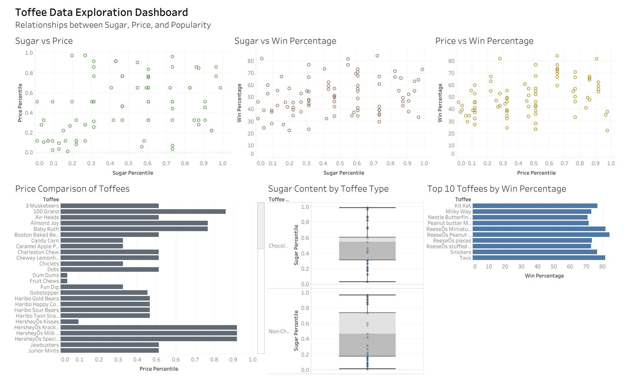
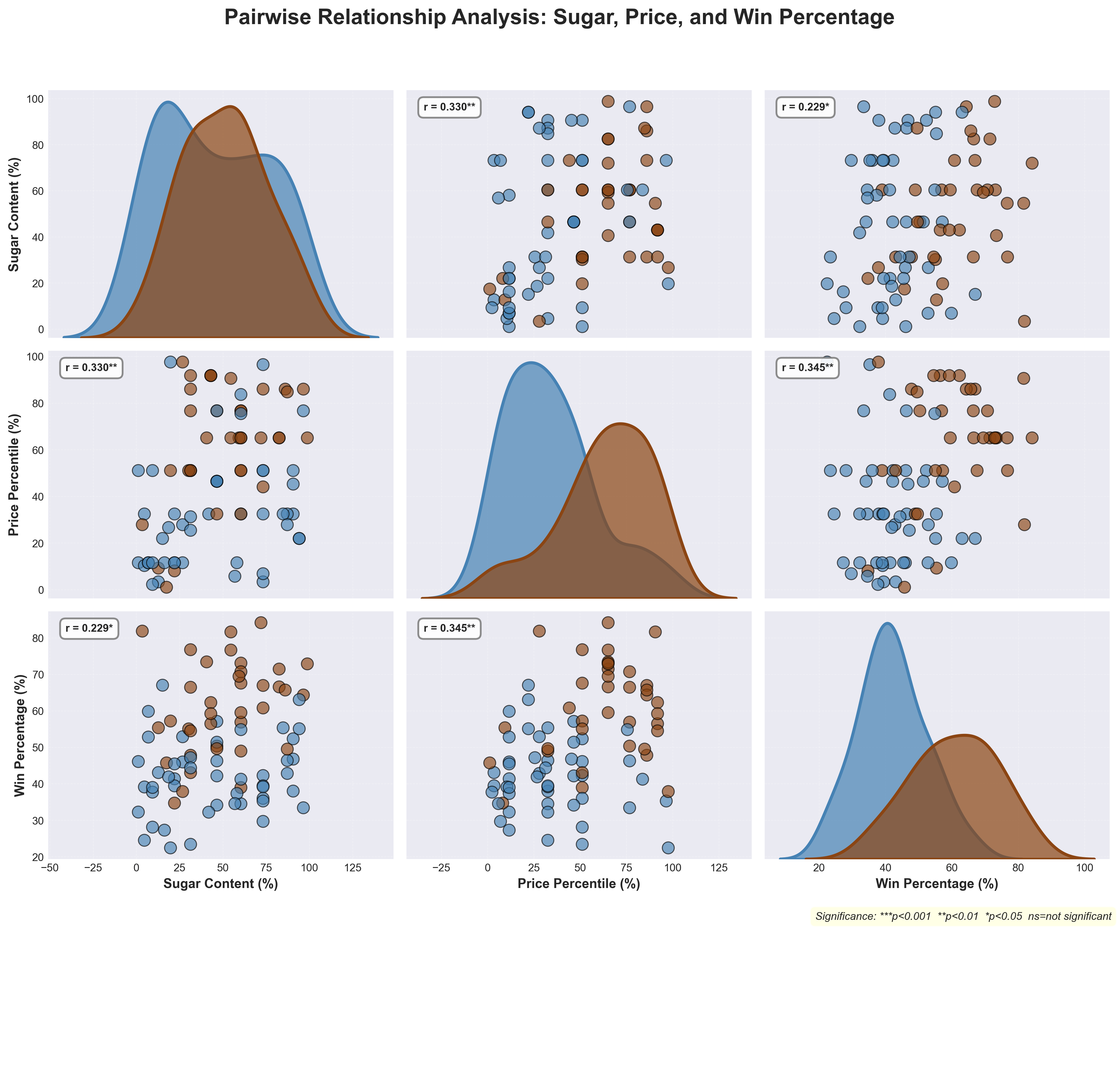
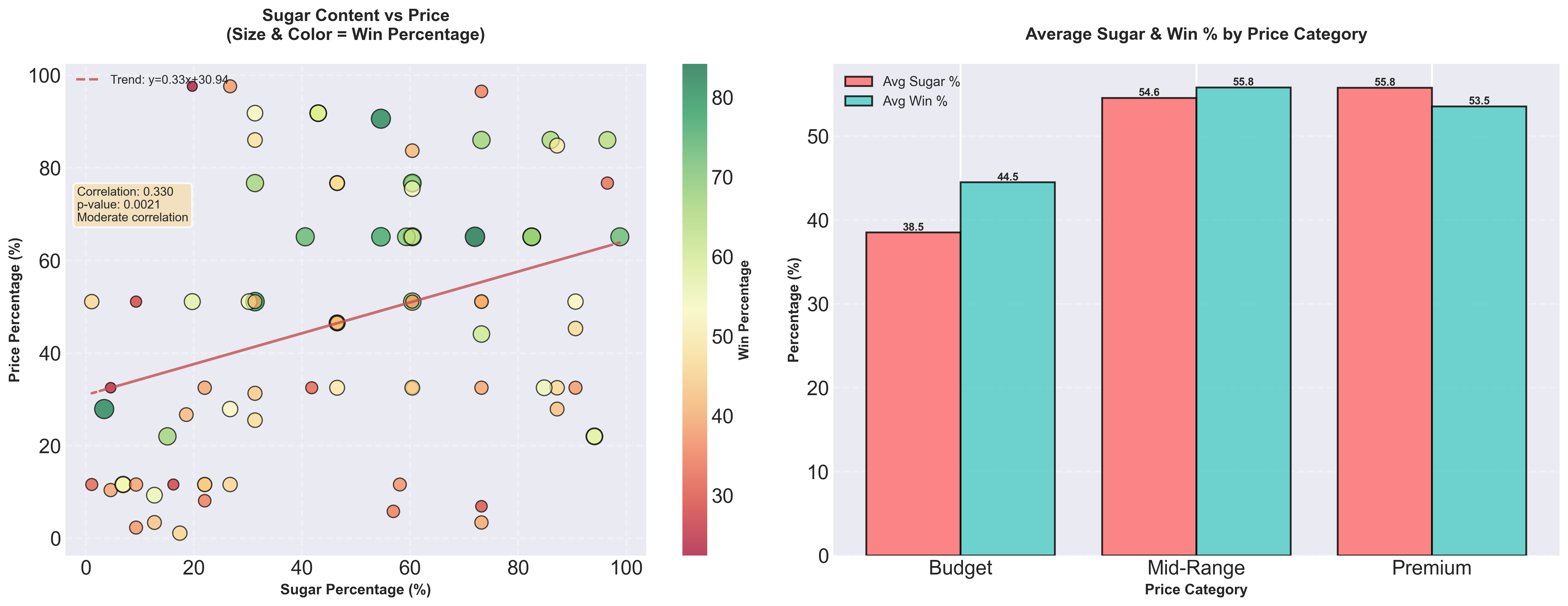
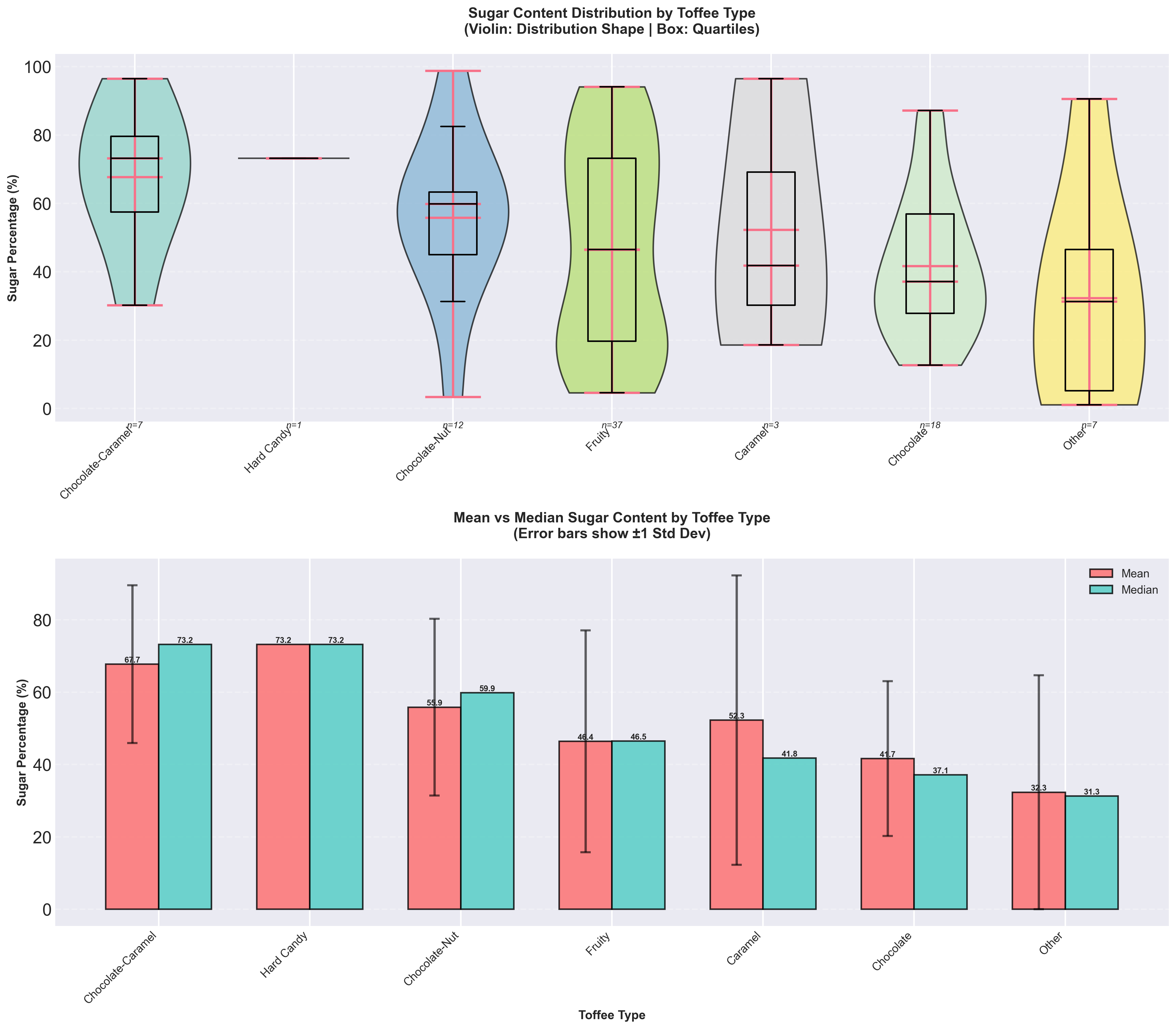
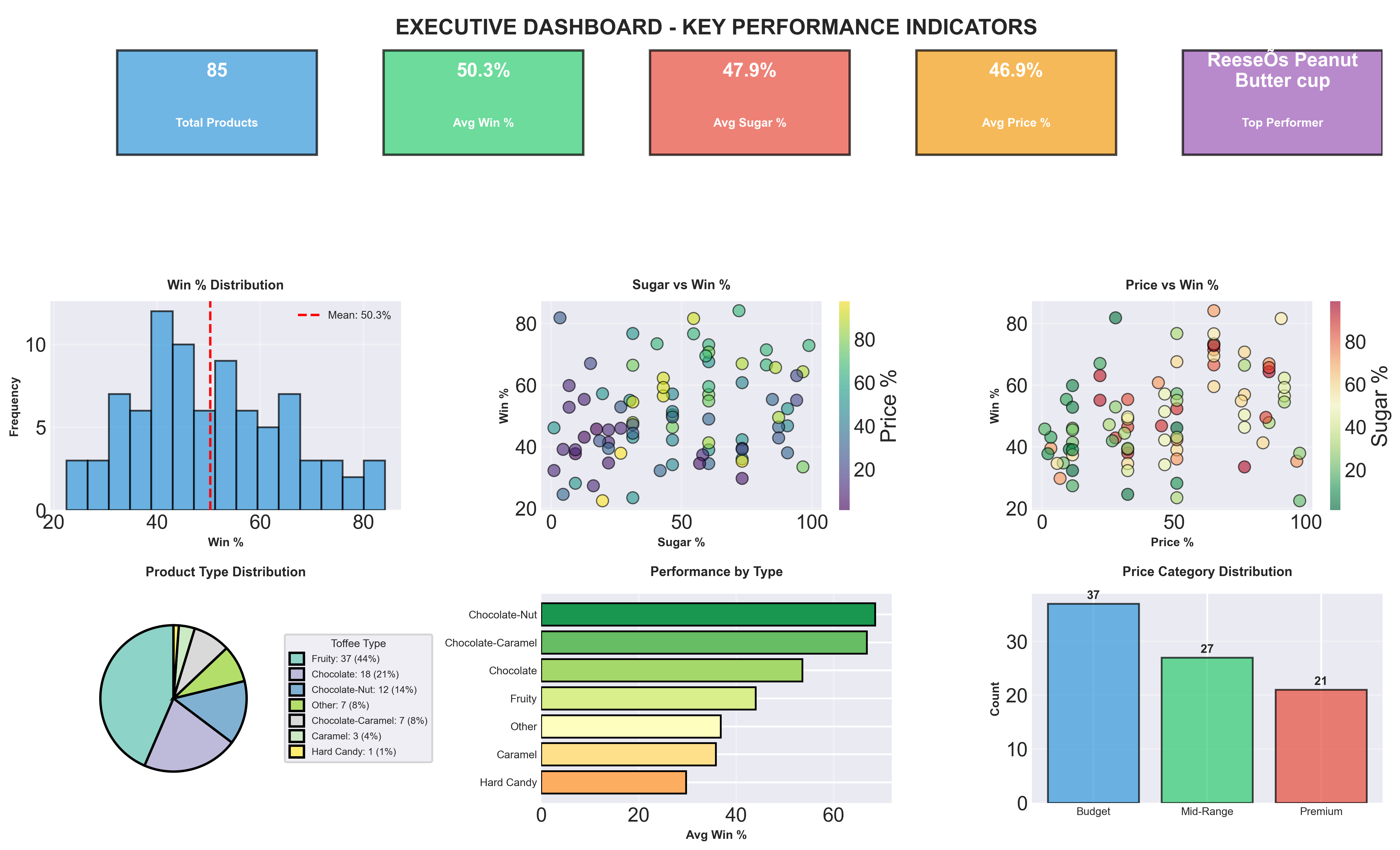
Exploratory Data Analysis (EDA) of a toffee dataset using Python (pandas, matplotlib, seaborn) and Tableau. Relationships between sugar content, price, and popularity with scatter plots, pair plots, box plots, bar charts, and dashboards.

PythonpandasmatplotlibseabornscipyJupyterTableauEDAData VisualizationCorrelation AnalysisDashboard
View repository

Problem statement

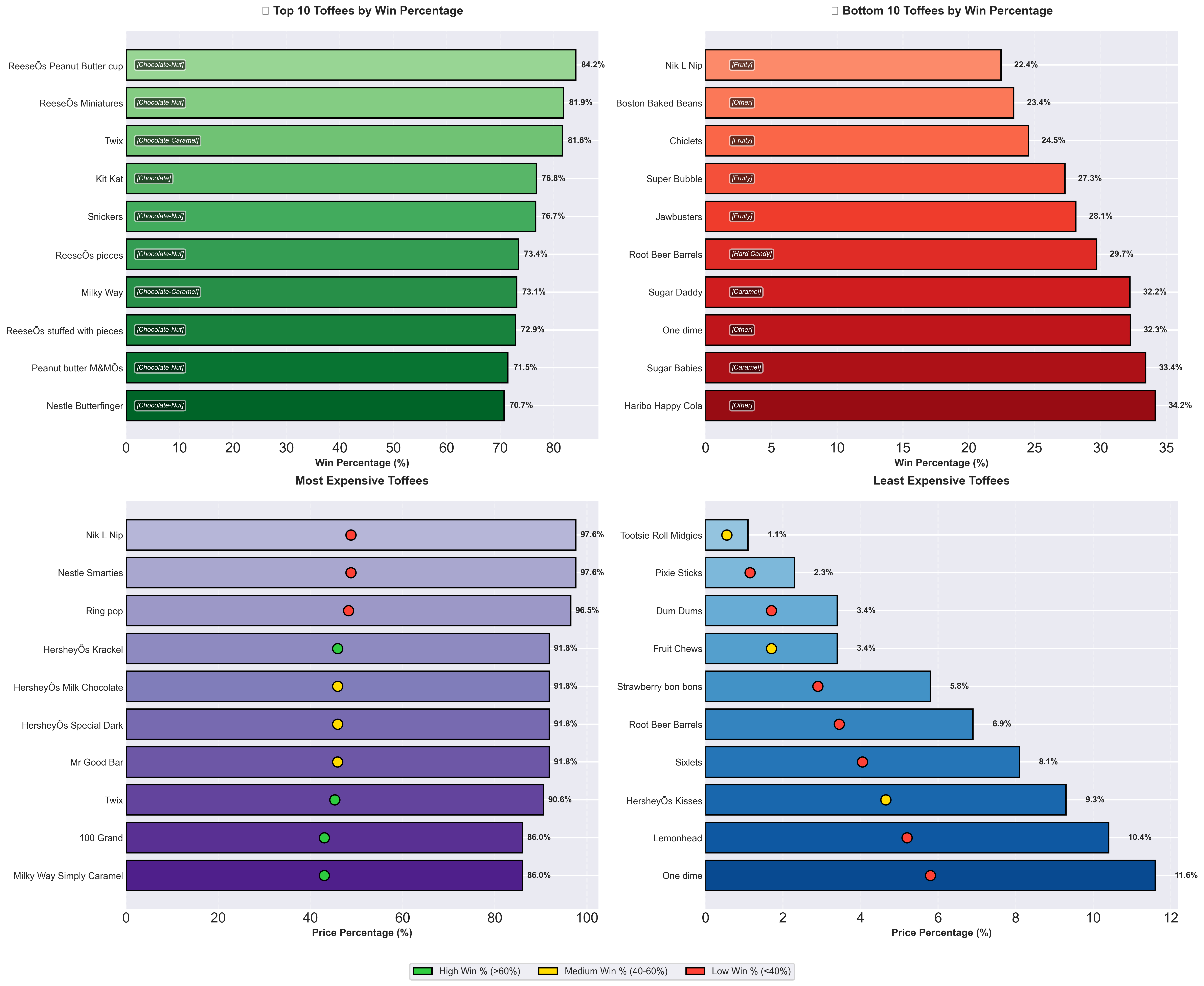
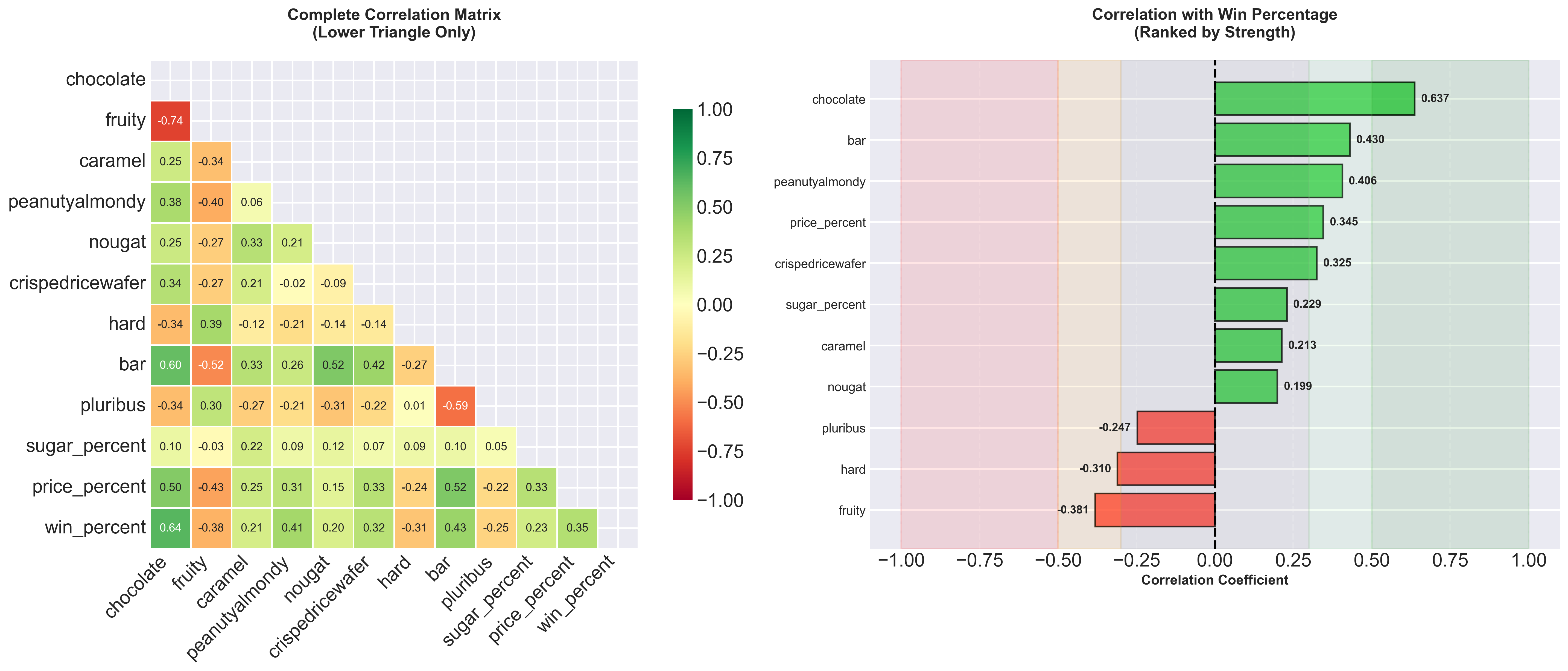
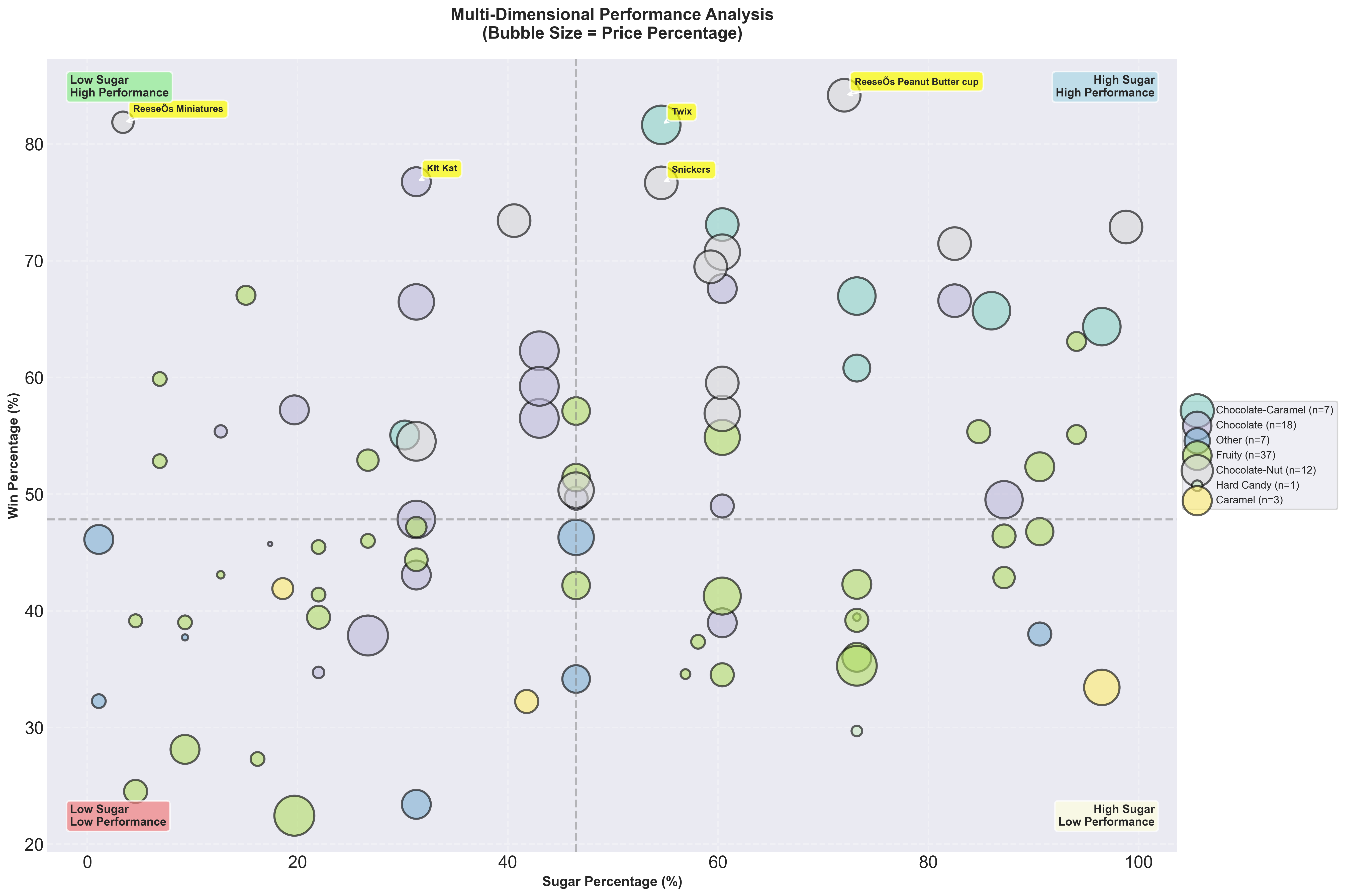
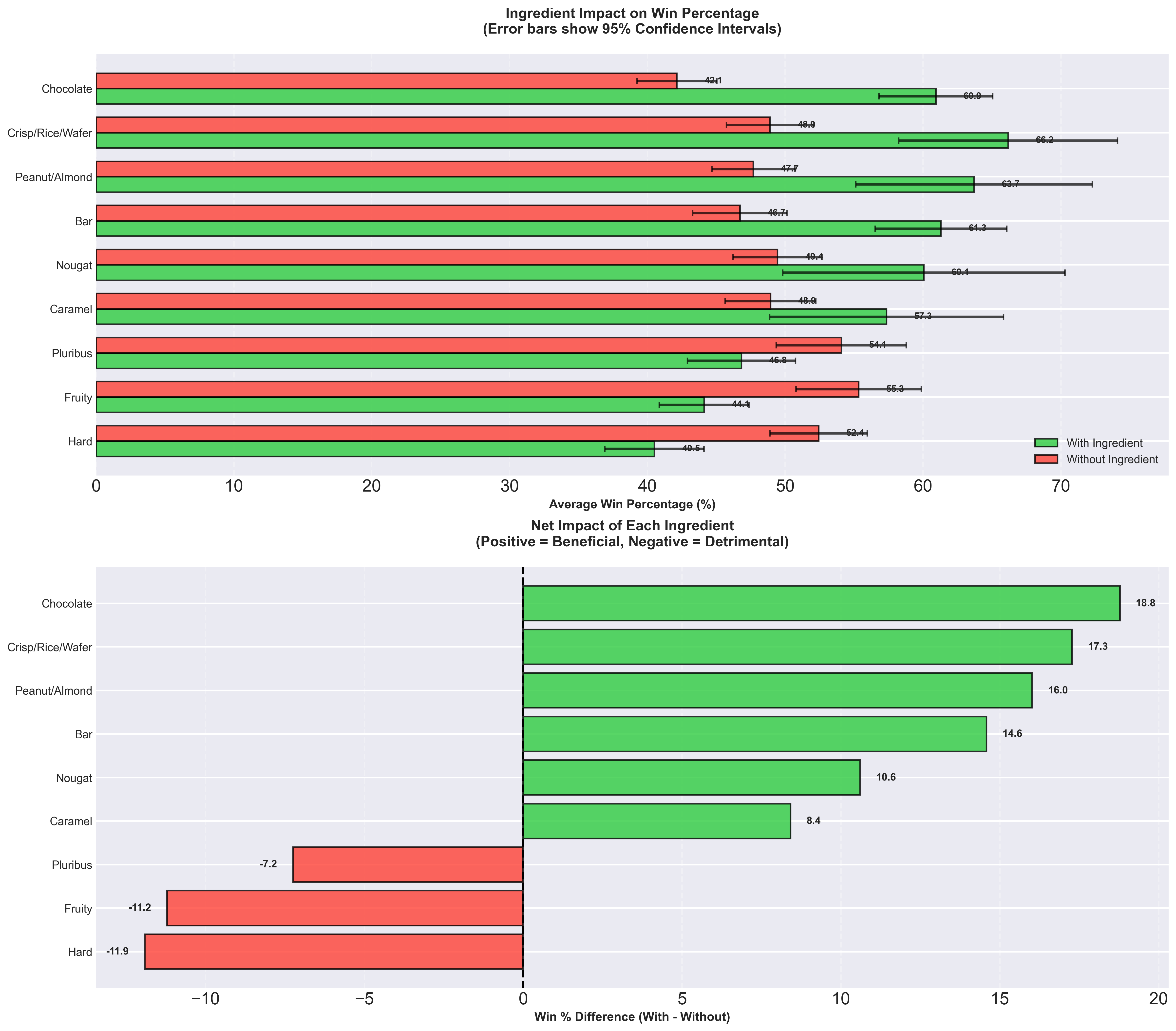
Explore what makes certain candies more popular using the same analysis in Python and Tableau: sugar vs price, type-based patterns, top performers, and ingredient impact on win percentage.

Architecture overview

toffee-data.csv → Jupyter (pandas/seaborn) → PNGs + CSVs; same data → Tableau → interactive workbook, dashboard PDF, PPTX.

Challenges & learnings

  • Keeping Python and Tableau narratives aligned; learned to structure EDA for dual deliverables.
  • Designing an executive dashboard that summarizes key KPIs in one view.

Features

  • Dual implementation: Jupyter notebook (Python) and Tableau workbook
  • Scatter, pair, box, bar charts; correlation heatmap; bubble chart; executive dashboard
  • CSV outputs: analysis summary, correlation matrix, ingredient impact
  • Tableau packaged workbook, dashboard PDF, and PowerPoint deck

Visualizations & outputs

Charts and dashboards from the analysis (Python/Tableau).

Toffee data exploration - project overview
Pair plot — sugar, price, and win % relationships
Sugar vs price analysis
Sugar content by toffee type
Top & bottom performers and price extremes
Correlation analysis
Multidimensional (4D) analysis
Ingredient impact on win %
Executive dashboard
Executive dashboard