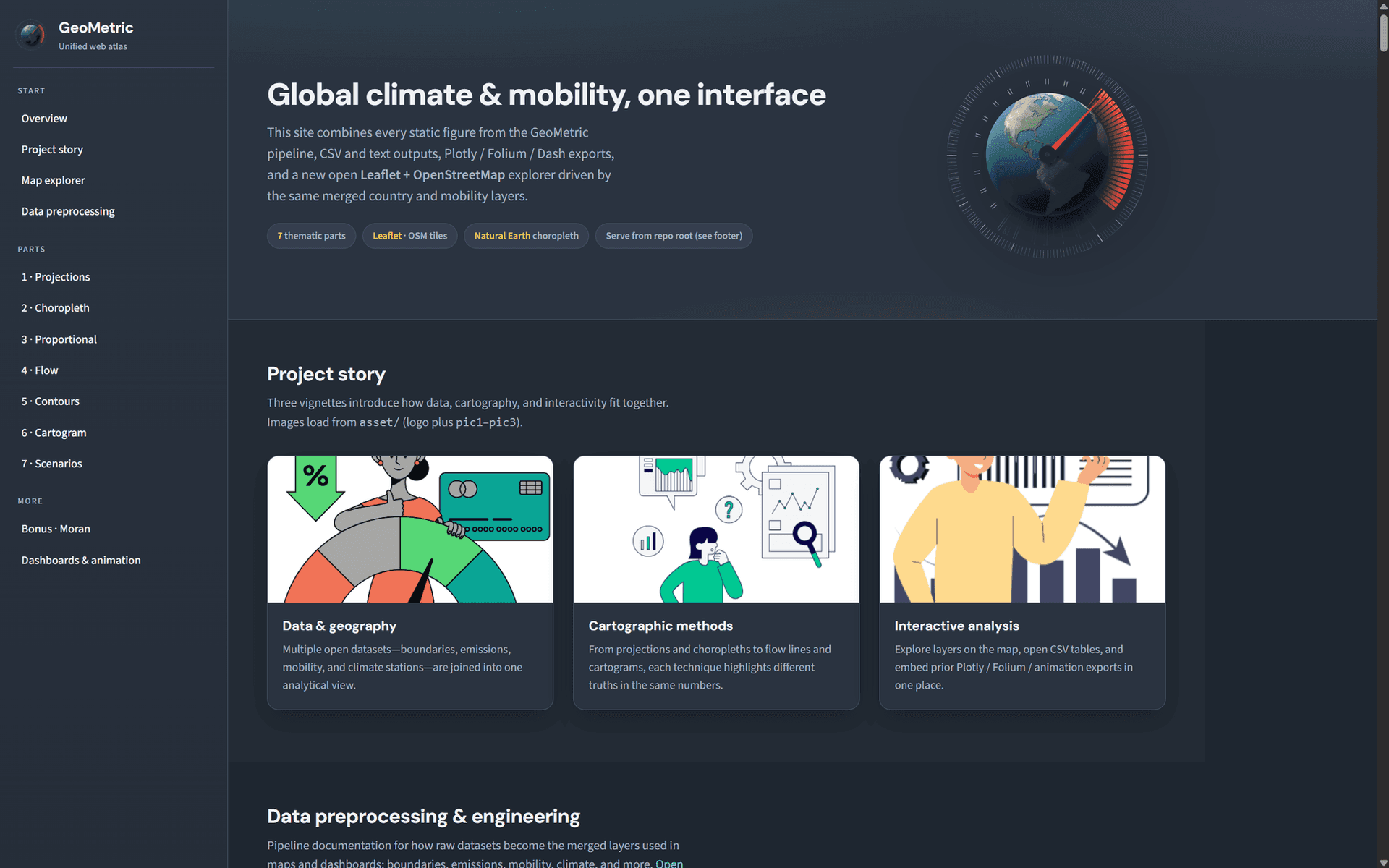
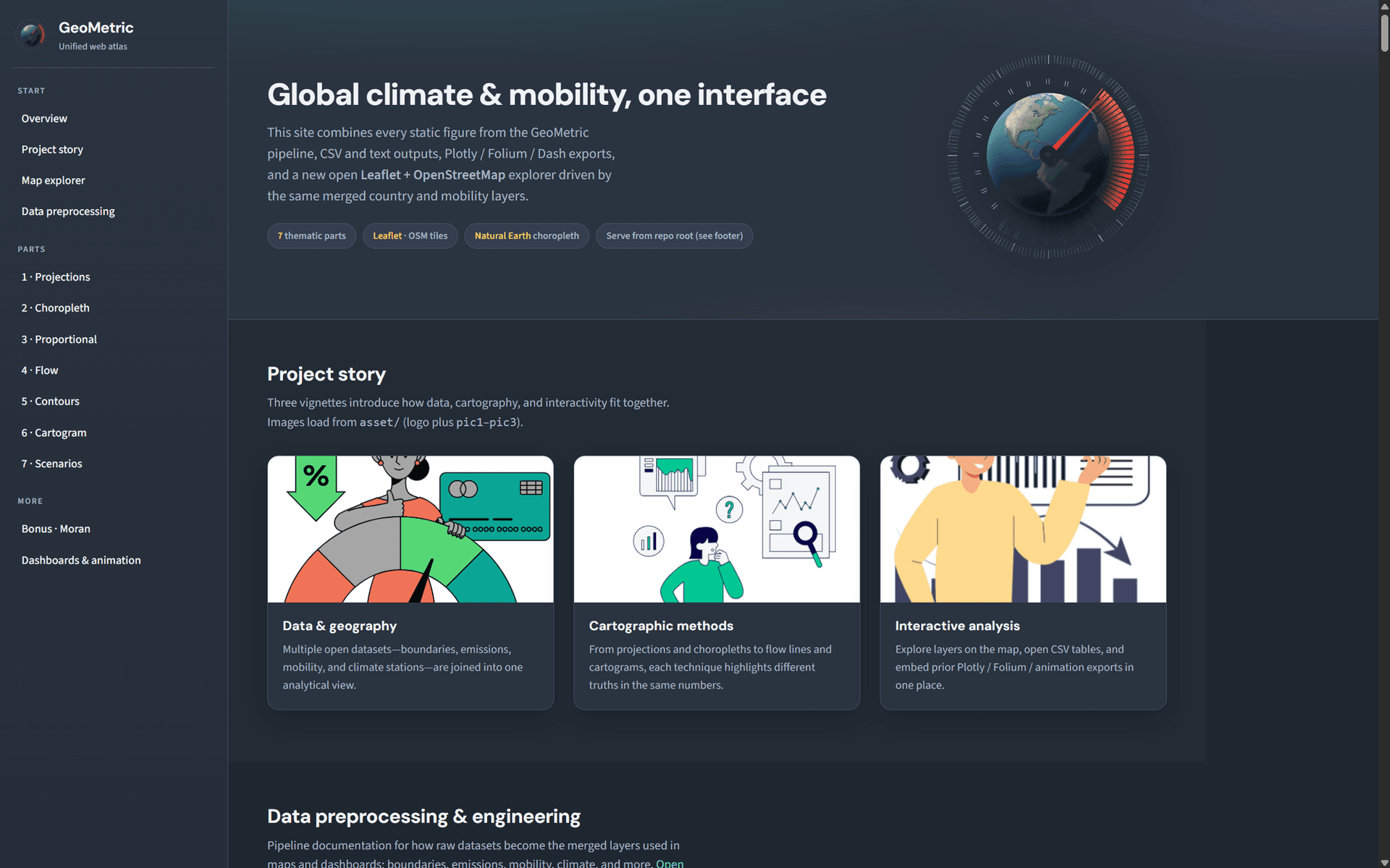
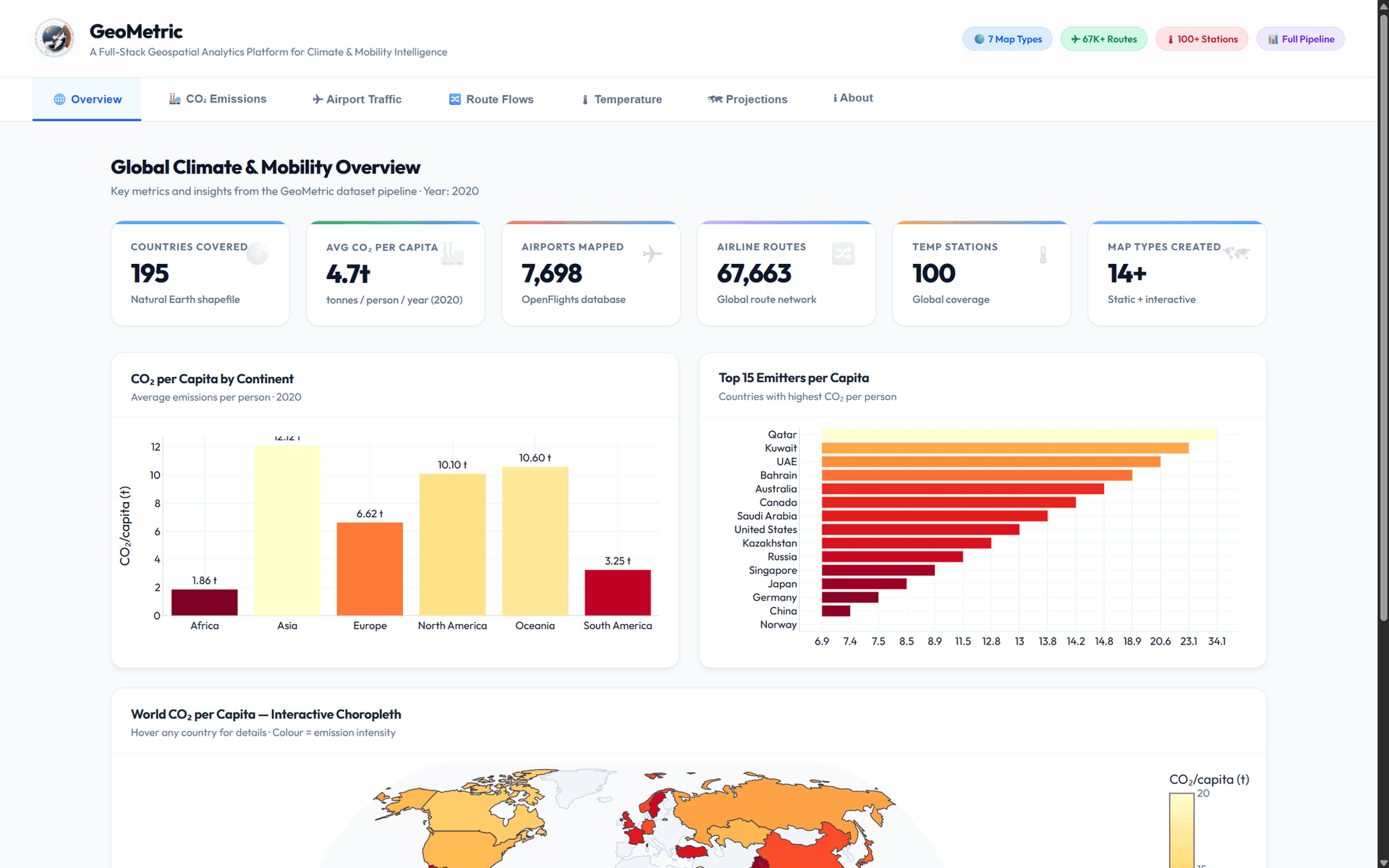
A map is a design decision before it is a chart. This works through the main families of thematic mapping to show what each one is honest about and where each distorts.
Architecture
data_loader -> preprocess -> seven part scripts -> PNG figures at 300 DPI plus interactive HTML, driven by a single run_all.py entrypoint.
What it does
Seven mapping parts from projections through to scenario-based map design
Spatial statistics including Moran’s I and LISA cluster analysis
Interactive exports to Folium and Plotly alongside 300 DPI static figures
Optional Plotly Dash dashboard and a static Leaflet gallery
One pipeline entrypoint with draft mode and selective part execution
Challenges & learnings
Projection choice is not cosmetic: the same data supports different conclusions depending on what the projection preserves.
Cartopy is difficult to install through pip on Windows and needs conda-forge first, which is worth documenting rather than leaving to the next person.