All case studies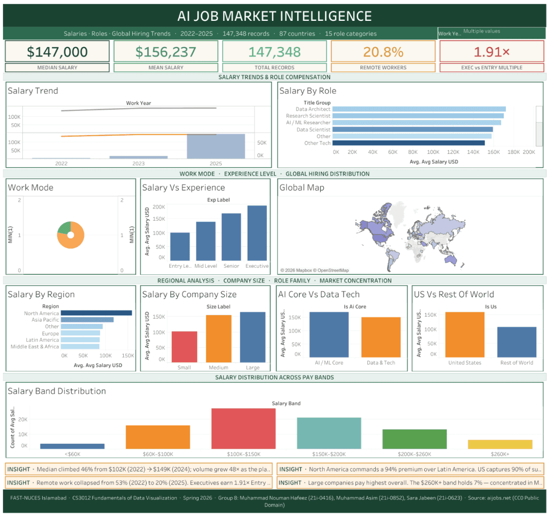
2026
AI Job Market Intelligence
Interactive Tableau dashboard over 147,348 real salary submissions, tracking AI and data compensation from 2022 to 2025 including the collapse of remote work from 53% to 20% across 87 countries.
Team project, 3 contributors. Preprocessing pipeline and dashboard build. Replace this line with your specific contribution.
- Salary records
- 147,348
- Remote work, 2022 to 2025
- 53% → 20%
- Countries covered
- 87
Stack
- Tableau
- Python
- pandas
- NumPy
- SciPy
- Jupyter
- Data Visualization
- Feature Engineering
Problem
Salary conversations in AI run on anecdote. This uses a first-party crowdsourced dataset to answer five concrete questions about pay by role, career level, region, company size and working mode.
Architecture
salaries.csv (151,445 raw rows) -> five Python preprocessing scripts -> salaries_enhanced.csv (147,348 rows x 27 columns) -> Tableau workbook with ten worksheets and one master dashboard.
What it does
- Ten coordinated Tableau worksheets, five KPI tiles and four insight callouts on a single 1200x1500 canvas
- Click-to-filter cross-actions where selecting a country on the map re-scopes every other panel
- Five-stage Python preprocessing: full-time filter, year filter, 1st-to-99th percentile outlier removal, label mapping, then twelve engineered columns
- 406 raw job titles collapsed into 15 comparable role categories by keyword matching
- Published under CC0, with authenticity checked against distribution shape rather than assumed
Challenges & learnings
- Verified the dataset was genuine rather than synthetic by checking for the marks real labour data leaves: right-skewed salaries, US dominance at 90%, and 406 messy title variants instead of a clean list.
- Ordinal encoding was needed so Tableau would sort the experience axis by seniority rather than alphabetically.
- Engineered twelve derived columns specifically so the dashboard could show each row against its year and role average, rather than in isolation.